UX Writing Challenge
14 days
About
Become a Better UX Writer in 15 DaysMy UX buddy has got me into this. She suggested we would discuss the topic and somewhat work on it together.I signed up with an email address to daily ux writing and receive a UX writing prompt in my inbox for the next 14 days which will also include a final full-length content challenge on day 15.Practice makes perfect. Just practice.
Day 1
Scenario: A traveller is in an airport waiting for the last leg of a flight home when their flight gets abruptly cancelled due to bad weather.Challenge: Write a message from the airline app notifying them of the cancellation and what they need to do next.Headline: 45 characters
Body: 175 characters max
Button(s): 25 characters max
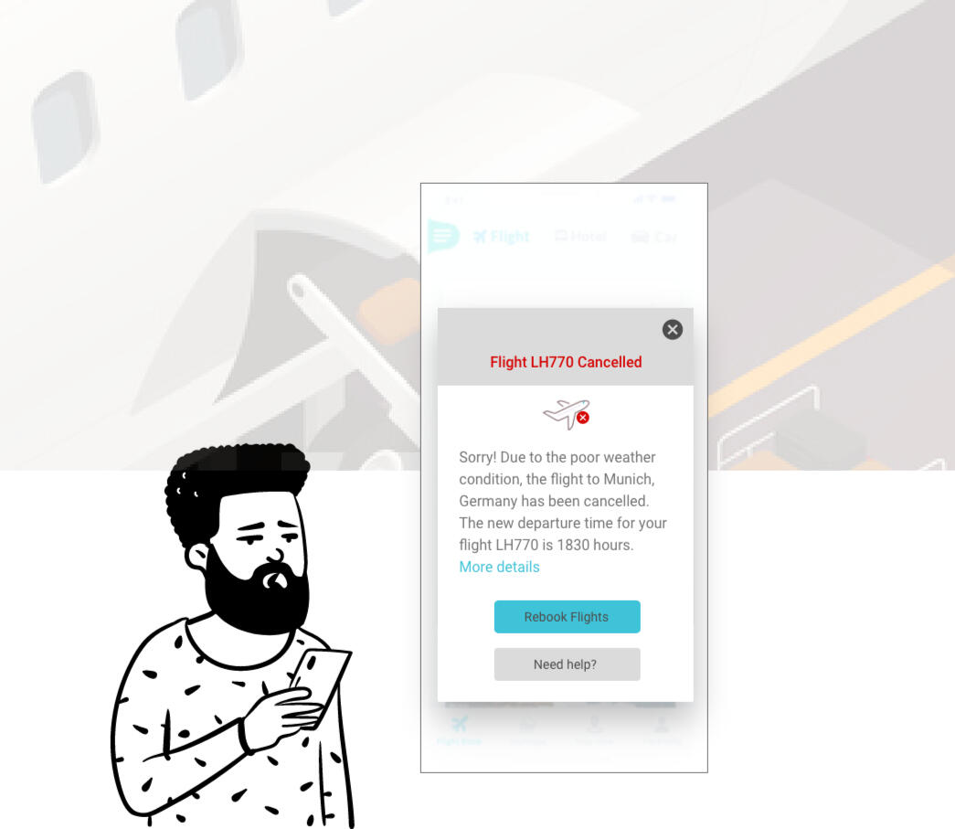
Images from openpeeps and flaticon
What I did
I opted for a light theme and alert message (in red) to grab user's attention. A plane icon with cancelled (in red) to rely the message.With much anticipation to fly home or get to the next destination, passengers would appreciate to get information pertaining the next possible flight, rebooking options and when necessary further assistance especially for passenger who might have health conditions.What I thought
I added a link for "More details" where this could contain additional information where airlines can add their offering such as
- snacks & refreshment
- beverage vouchers
- lounge area
- weather forecastPassengers may appreciate these especially when it may be long extended hours of wait. The comfortable armchairs with access to light beverages could calm the group.Last but not least
After that I copied my text to google documents to get a word count to make sure my task is fulfilled as required - 164 characters including space.
I had experienced a couple of flight delayed and cancellation. The peep face is real.
Day 2
Scenario: A user is a working parent, and a big sports fan, in the midst of their favourite sports season who can no longer attend games.Challenge: Write a promotional screen for an app that lets a user choose teams, sends game reminders, real-time score updates and highlight videos.Headline: 40 characters max
Body: 175 characters max
Button(s): 25 characters max
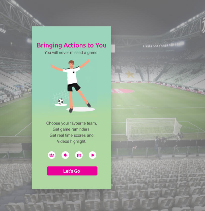
What I did
Use shade of teal to resemble the field and magenta that energises the key message to the sports season. To make it easier for users to read, each feature is placed in a single line.What I thought
The use of universal symbols to represent each features
- team
- reminders
- scores
- videosAnd using the same magenta for the button to get things started.
Day 3
Scenario: The user entered the wrong email address to sign in to their account.Challenge: Tell the user to enter the right email.40 characters max
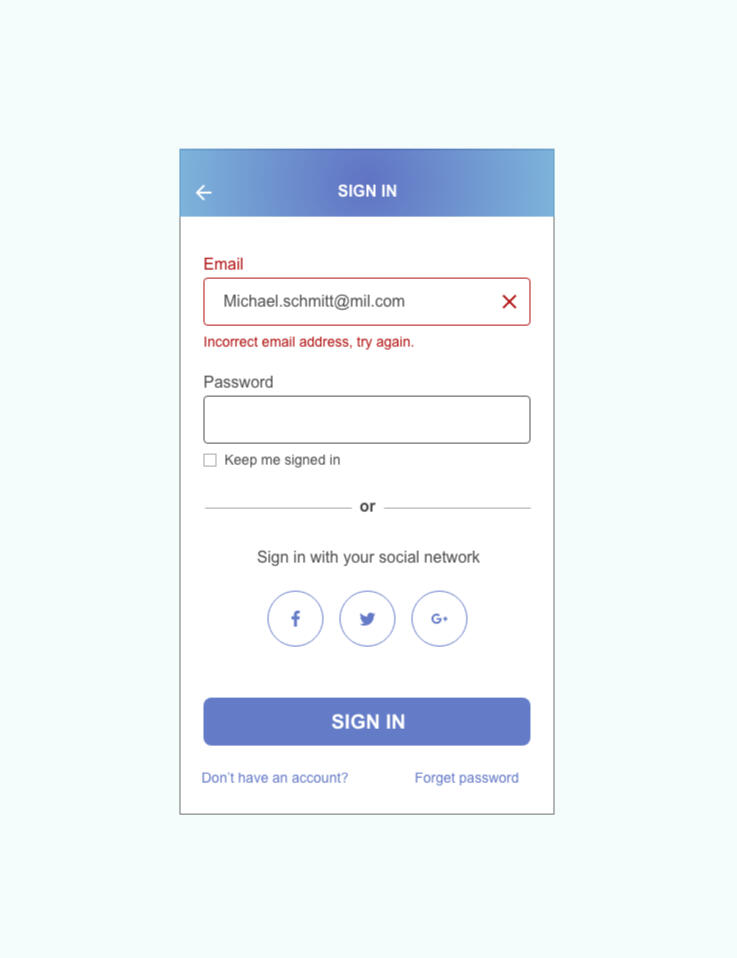
This is one of the most common interaction we use on a daily basis. So it is kept simple.What I did
The error is highlighted in red so it is obvious to the user where the mistake is. A "X" symbol indicates incorrect input.With 35 characters - "Incorrect email address, try again."It is possible that we typed too quickly and missed a letter. I added the words "try again" to encourage the user to check the email address and try to input the missing letter and/or replace the incorrect field again.What I thought
To add other sign in options, sign up as well as forget password to direct user easily to the next step.
Day 4
Scenario: A user is in their favourite supermarket. They open the supermarket’s app on their phone to see what’s on sale and are greeted by a promotion.Challenge: Write a promotional home screen for a subscription service that delivers groceries to the user once-a-month for a flat fee.Headline: 45 characters max
Body: 175 characters max
Button(s): 25 characters max
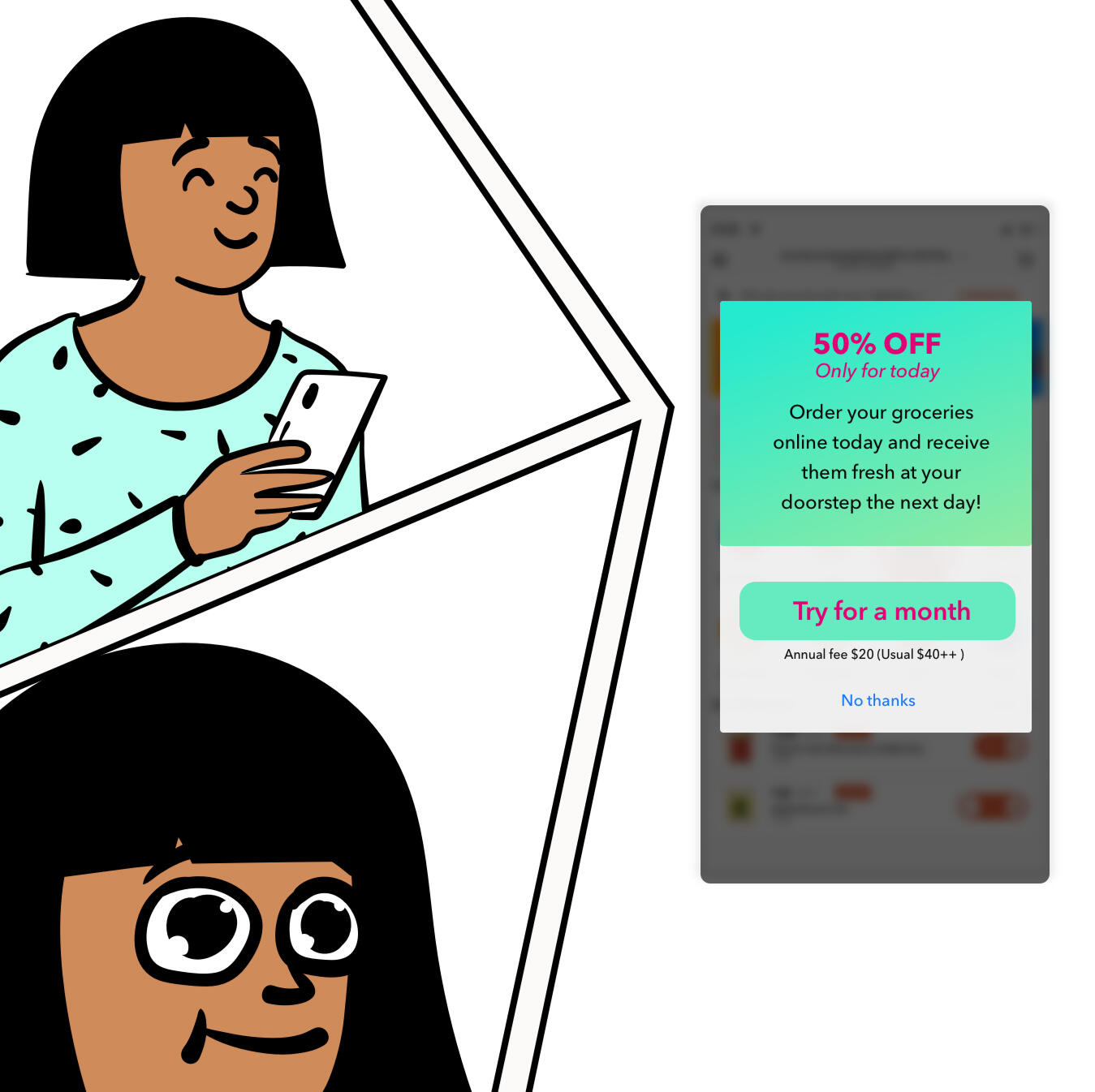
Images from openpeeps
Keeping in mind that many of us are most likely receiving multiple marketing adverts on a daily to weekly basis.The highlight here would be the amount of savings or discount the customers can get. Everyone loves a good discount! As well as feeling safe that they can easily cancel the subscription without penalty or tied to a year long subscription. To get a win-win situation out of this...What I did
Use an attractive discount of 50%, to capture the attention of the customer for an extra seconds, keeping the customer intrigued about the rest of the promotional information. In addition, the promotion lasts only for the day, this important details highlighted in hot pink.User clicks on the "Try for a month" button leading them to sign up for this service. User can continue with the service the following month or cancel it with refund option.What I thought
Customer has the option to skip the discount with a simple "No thanks" and this option is not prominent. Selecting this option will close the message.
Day 5
Scenario: The user works in graphic design. While critiquing a design in a mobile app, their phone abruptly turns off. When they restart the phone, they reopen the app.Challenge: Write a message that the user will read immediately upon opening the app. What do they need to know? What steps (if any) do they need to take to recover their content? What if they can't recover the content?Headline: 40 characters max
Body: 140 characters max
Button(s): 20 characters max
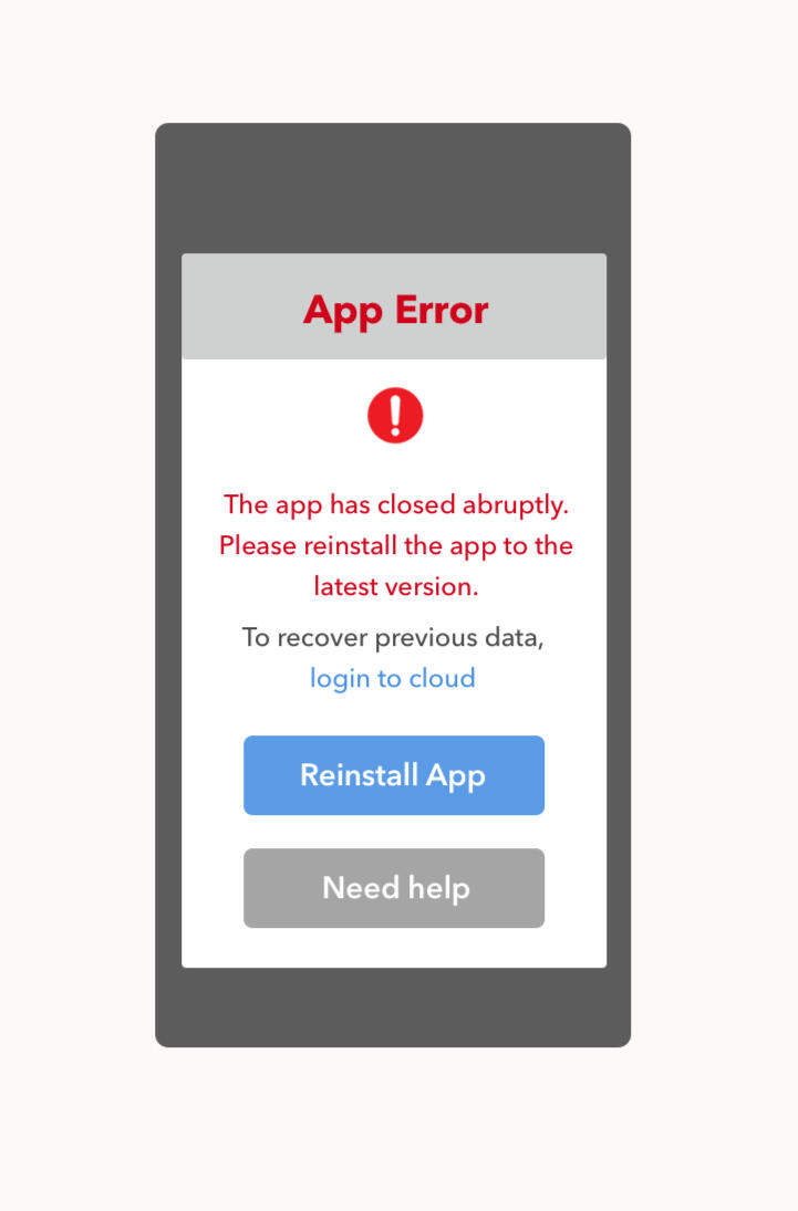
Icon from flaticon
This task has a similar aspect to Day 1 task with important notice (in red), acknowledge something happened, call to action button as well as provide alternative options for help. I googled "Solutions to fix App Crashes and Keep Apps Running" to get more informed of the possible errors that causes app crashes.As there could be a few reasons why an app is not working, I added some assumptions.Assumption
- User has already an existing cloud service to retrieve such data.
- This is an internal error or a bug and reinstalling the app is the CTA.
- In the event, user has already reinstall the app and see this message, the CTA "Need help" should lead to answers to other technical fixes.I think this would cover the basic.
Cindy Lin-Tschoeke | UX, UI & Visual Designer | [email protected] | Last updated in 2021